Published
How I Redesigned My Website

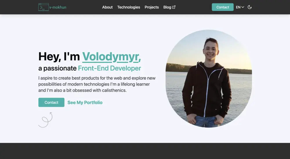
During the last few weeks, I’ve been working on redesigning my website. I wanted to share the process I followed and the tools I used.
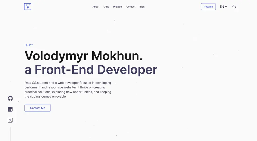
If you don’t know how my website looked before, here is a screenshot:
 You can also check the live version at v1.v-mokhun.com.
What I didn’t like
I can’t say that I don’t like the previous design, it’s just that I thought it lacks good color scheme, more animations, and content organization. It is alright, and I didn’t do much research on the design before implementing it.
A good thing, though, is I was able to avoid a complete rewrite of the functionality. I hardly changed the content of projects section and I left contact form as it was.
Design
Firstly, I’d like to thank and recommend the Syntax.fm podcast where in quite a few episodes I learned much about design principles, implementing good dark mode, typography, and where to find inspiration.
I finally decided to use Figma before actually coding the design. Given that I haven’t used it before, after watching a half-hour tutorial, I was able to wrap my head around it (well, somewhat). I looked for good portfolio websites online, took something from here and there, and here we are.
Oh, and if you’re curious, I created the logo on this logo generator, it’s good if you don’t want to draw anything yourself.
For a portfolio website content really matters, so I tried to make it as clear and concise as possible. I incorporated personal thoughts and AI to get the “best of both worlds”.
Development
As I’ve mentioned, I didn’t change much in the functionality. I really like the particles effect in the hero and skills sections, kind of neat. Also, hiding header on scroll down and showing it on scroll up is a nice touch.
Animations are done with React Spring, because I didn’t need anything complex and from my research, react-spring is a more lightweight solution than Framer Motion. I’m also excited about the Ripple Effect on the buttons, I probably spent good 2 hours on it.
Well, there’s really nothing more to say about development.
Thoughts
I hope this redesign will help me secure a summer internship or even my first job. I’ve been applying to various positions for half a year now with no luck, but that’s a story for another time.
If you have any questions or suggestions, I’d be happy to talk to you. My LinkedIn and Twitter are always open.

